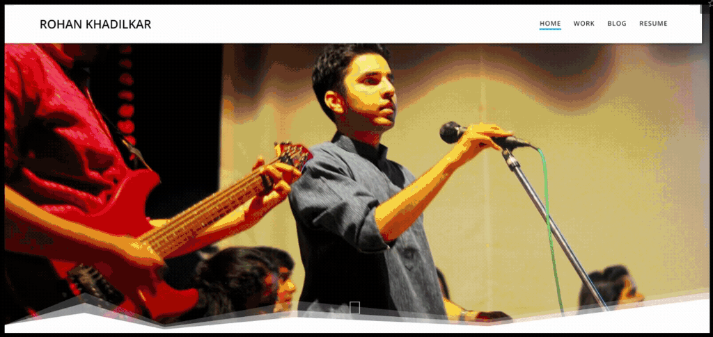
What I learnt from watching 30+ user sessions on my site.
I have always had Google Analytics on my site. While it has been super helpful in understanding the “what” in my data, the “why” was always missing.
I first came across Hotjar probably back in 2017, and I remember the exact reason why I didn’t go any further with it. I had a resource heavy WordPress theme, a shared web hosting plan and Google Analytics tags on every page. As you can imagine, the site speed was horrible. Adding a tool that does session recordings and heatmaps wouldn’t have been the best decision at that point. The features I was excited about the most were the very reasons for not using the tool.
But things changed. I got a lighter theme, moved to better web hosting service and realized that GA tags weren’t that big of a problem. It was time to finally play around with Hotjar. Do note that this is by no means a review of the tool. Hotjar does a lot of things, some of which I haven’t looked at, at all (funnels, forms, surveys etc.). The two features I did use (and like I mentioned earlier, I was most excited about) were session recordings and heatmaps.
This was a fun exercise than anything else. Heatmaps were fascinating, session replays even more so. I learnt a lot about the way people navigate my site, the actions they perform and their overall experience. This in turn helped me tweak a few things here and there, which hopefully now provide a better user experience.
Lesson 1— Removing friction
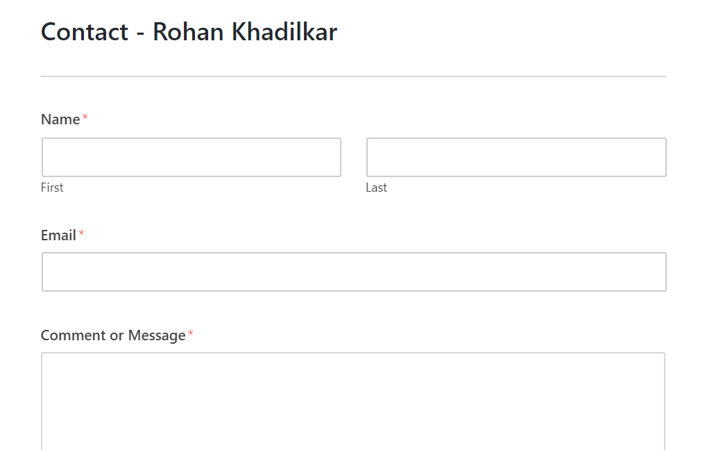
What I learnt — No one used the contact form on site. Not one.
Bad UX — When was the last time you filled out a form to get in touch with someone? Don’t remember? Exactly. In some of the previous iterations of my site, I had a contact form which never served its purpose. Couple of things which come to mind — filling up a form is a more “formal” process, something you do when you want to get in touch with a sales team or customer support, but not when you want to get in touch with an individual. Secondly, you need to provide some sort of contact information if you expect to hear back. A mandatory email/phone form field is a huge user friction point. No one’s giving you their personal information.
Good UX — I moved to a shorter concise form of communication. I did away with the contact section and added Drift chat instead. Huge shoutout to Drift here — one of the best applications I have used in recent times and especially super impressed with how much they bundle in with the free plan. Some of my favorite things about the tool (in no particular order) –
- Cookies! You can have a multi session conversation with a user without collecting any of their personal information.
- Personalization! Different messaging rules fire based on the actions the user takes.
- Non-intrusive! It sits quietly in the bottom right corner.
- 1 click access! Irrespective of where the user is on your site, they are 1 click away from speaking with you.
- Slack integration! You can reply to messages through Slack.
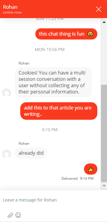
The success metric here wasn’t the number of messages I get, but to remove the obvious user friction (providing contact information), thereby making the process of connecting a lot easier. Would you rather fill out a long tedious form on one specific page or would you like the option of sending a “Hi” from anywhere on the site?
Lesson 2— Aligning actions to expectations
What I learnt — There were a few mobile sessions where the user clicked on “Resume” — while some continued scrolling the page they were on, others exited the site.
Bad UX — If you are on the home page of my site, there are two ways to get to my resume — either by clicking on the blue CTA or via the top menu bar. Either of these actions would get you a pdf version of my resume. Now this was completely fine if you were on your laptop. Most common browsers would open the pdf in the browser itself but when you perform the same action on your phone, the file gets downloaded. Why is that a problem? You clicked an element on a site that didn’t at all indicate that a file would get downloaded on your device, and yet it now sits in your Downloads folder.
There are essentially 2 user paths from this point –
- Resume downloaded → User continues to scroll → views pdf at some later point after exiting site
- Resume downloaded → User exits site to view pdf → long pause in session → returns back to site

In either case, I break the user journey. The user HAS to at some point navigate away from the site because they inadvertently downloaded a file on their device.
Good UX — Clicking on resume now takes you to a web version of my resume. On this page, you have the option of downloading a pdf version if you want. Another small yet important design addition was the download icon. This provides the user a clear understanding of what clicking on the CTA would entail.
Lesson 3 — You are not the user
What I learnt — You are not the user!!!
Bad UX/Good UX — There’s no good or bad here, but the realization that you can’t build for everyone. Every user is different and that shows in the way they use your product. For instance — I put considerable effort in finding the right content and while few read the things I’d written, the majority didn’t care.
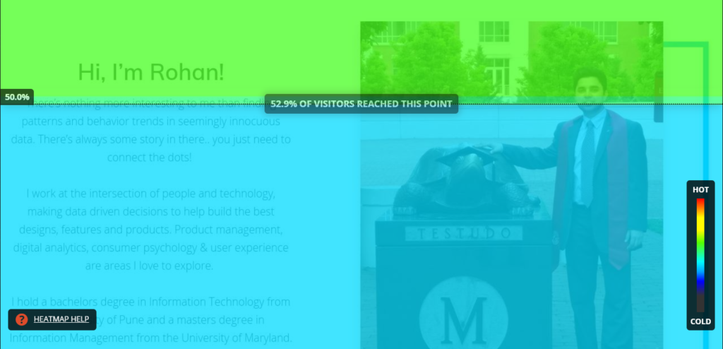
The average time on site was less than 60 seconds. Granted, there’s not a lot to do but the speed of scrolling was indication of how staggeringly low attention span we have.
I loved watching these session recordings. It makes you realize how important it is to get into your user’s shoes — understanding who they are, what drives them, what excites them..
There’s immense value in a tool like Hotjar. Any product or design change impacts the user and instead of thinking about what that impact might be, this is a sure shot way of eliminating the guesswork and relying on facts to guide your decisions.